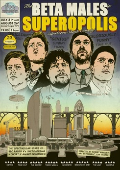
 The Beta Males' 2013 poster
 Knowing shit-all about design ourselves, we asked one Tom Hyatt to share his most important tips for designing a Fringe poster and poster.
How do you go about coming up with ideas for posters/flyers?
Poster design is a great opportunity to balance form and function; it's like architecture! You look to make something that works simply as an aesthetic experience, but also successfully performs another function - in the case of posters it's delivering information and selling a show. Personally speaking, my taste is to try to achieve the latter by way of the former as best I can.
 Another of Tom's designs
 With The Beta Males in Superopolis design [pictured above], for example, after consultation with the group, we decided to make the poster and flyer look like a comic book to match the Superhero themes of their narrative comedy sketch show. Each of their Edinburgh shows are very much about believable world-building, and so I set out to reflect that by depicting the five Beta Males looming like Green Lantern's Guardians of the Universe over a depiction of their fictional city. There were standard poster elements too such as stars from past reviews, but I felt that these should come secondary to a more eye-catching way of selling their particular show.
I find that if I enjoy a project I will put a lot of effort and time into it to make it something to be proud of. Fundamentally, I pick ideas for posters because I think I'll enjoy creating the outcome, and create it better as a result.
How important is consistency of design across a publicity campaign?
I think it goes without saying that it is very important - 'consistent' is very rarely used pejoratively! But for good reason: particularly somewhere like the Fringe, you are fighting in a giant royal rumble for the consciousness space in a person's mind. Every piece of publicity they see on The Mile and in the venues is jostling to be biggest in someone's head in that golden moment when they ask themselves, "What show should I see today?"
Having inconsistent designs across different parts of your PR is not necessarily reducing the size of your little army in someone's head, but it's spreading it out so as to make it almost invisible amongst the hordes of Everyone Else. Ideally you want your show's PR to be so closely knit so as to build an encampment in someone's mind, sending smoke signals up to their brains to go see it. </metaphor>
Click on image to see what on earth Tom's talking about.
How do you make a flyer/poster memorable or stand out?
I think standing out and being memorable are two different things. Consider those two friends you used to know in school: the loud mouth who would never not be visible and in your space (but never had a great deal to offer) and the quiet one who you hung out with those couple of times who had some interesting ideas about things. One stood out, whilst one was memorable.
To stand out you don't necessarily need memorable content. Ubiquity; bright colours and bold fonts; daring design decisions that not everyone else is doing. Look for the gaps in the posters you see and fill them, figuratively and literally.
To be memorable you need to do something with the attention you get, no matter how small that attention is. Something perhaps unexpected; content-filled; implications that stretch beyond the three weeks in Edinburgh.
Not to blow my own trumpet, but I think I/we achieved that with The Beta Males in Superopolis. The flyer in particular is a good example, which both stood out and was memorable because it was a full-colour comic book! You could take it home and it was still an enjoyable comic book, long after the show finished. It also served as a prologue to the show. A few in the group were unsure about breaking Fringe conventions with an A5 flyer (the vast majority are A6), but it turned out to be very popular and the risk paid off.
 Click to find a zoomable image
 Coolest poster / flyer you've ever seen?
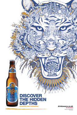
So, not Fringe related, but one night I was walking down Upper Street in Islington [London] and saw a backlit poster on a bus stop. White background, huge blue tiger face roaring out (think china cups). As I got closer the tiger was made up of lots of smaller interwoven images, and it became clear it was an advert for Tiger beer. Really impressive impact from a distance, and memorable when close up.
Big poster/flyer no-nos?
Personally I hate it when the stars are too big. Every poster has them, it's "what you do" at the Fringe, and some people would say NOT having big stars in the print design is a big no-no. For me, I'd rather use the space for original ideas.
It's part of how our brains work to phase out repeated stimuli, such as the sound of a fan or the touch of our clothes. Walking around Edinburgh, I think you pretty soon start to ignore the stars on posters, making them a poor choice for the main focus of a design.
What design tools do you use for making posters?
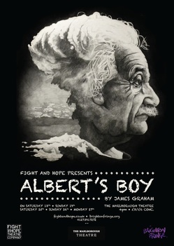
A lot of my work is hard drawn so there's your usual pens and paper for a lot of it. A poster I made for a production of a play called Albert's Boy had a full pencil drawing as the body of the poster, with Einstein's head being merged into a mushroom cloud!
At some point, however, I'll work on the design in Photoshop, at a high resolution so as to cover all bases. I used a tablet input to colour The Beta Males comic and was very impressed by that, so potentially I could shift to more digital work in future.
Tom Hyatt designed our Cracking the Fringe logo, but he's also a rising singer-songerwriter and all-round nice guy. Check out his website and his music. Go on.
 RSS Feed